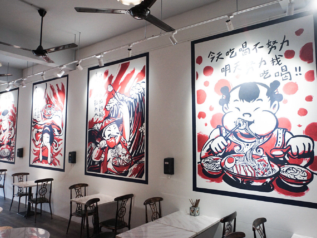
PACKAGING DESIGN 05
Packaging Design / Brand Visual / I Think OK
Packaging Design / Brand Visual / I Think OK
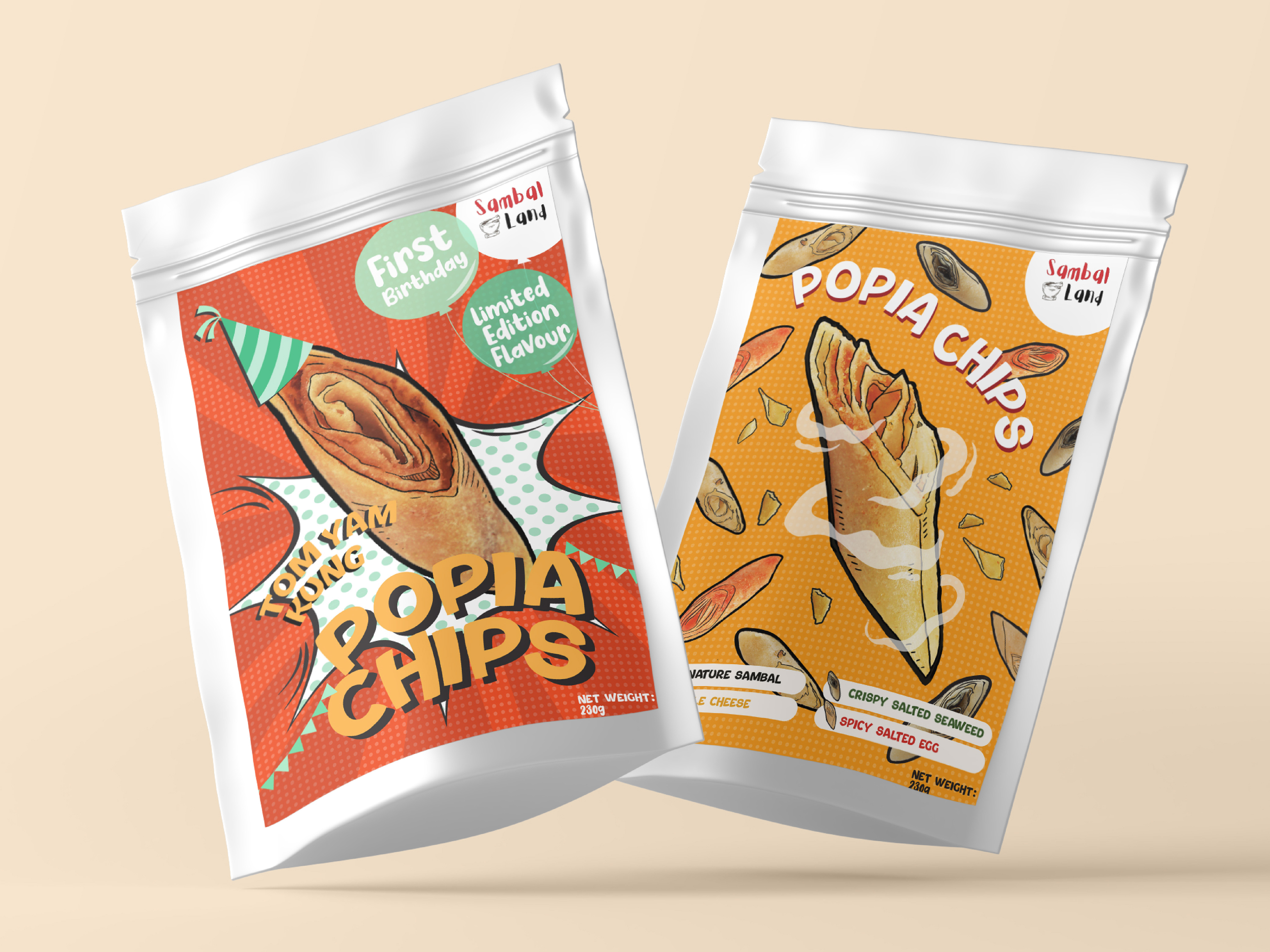
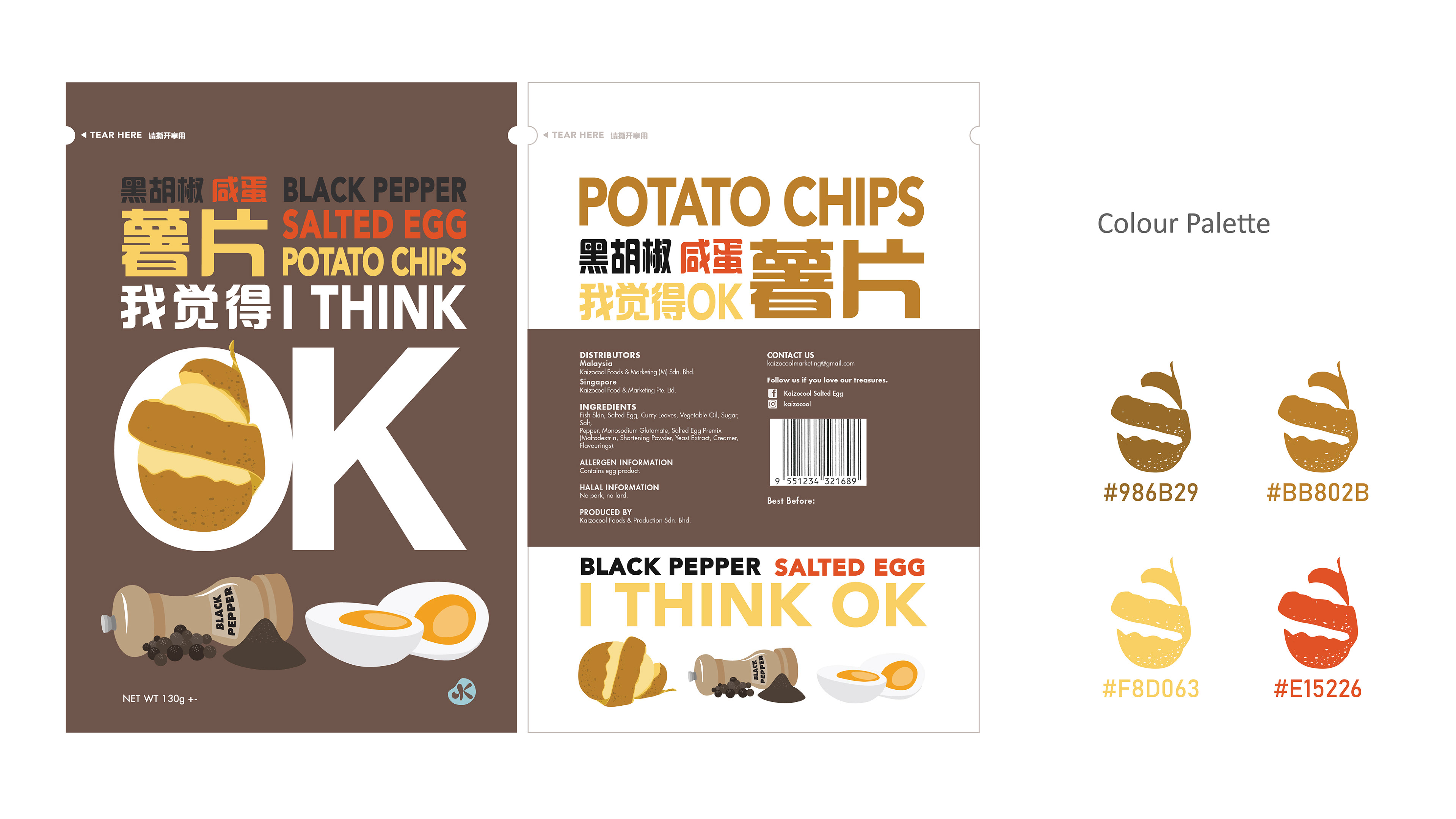
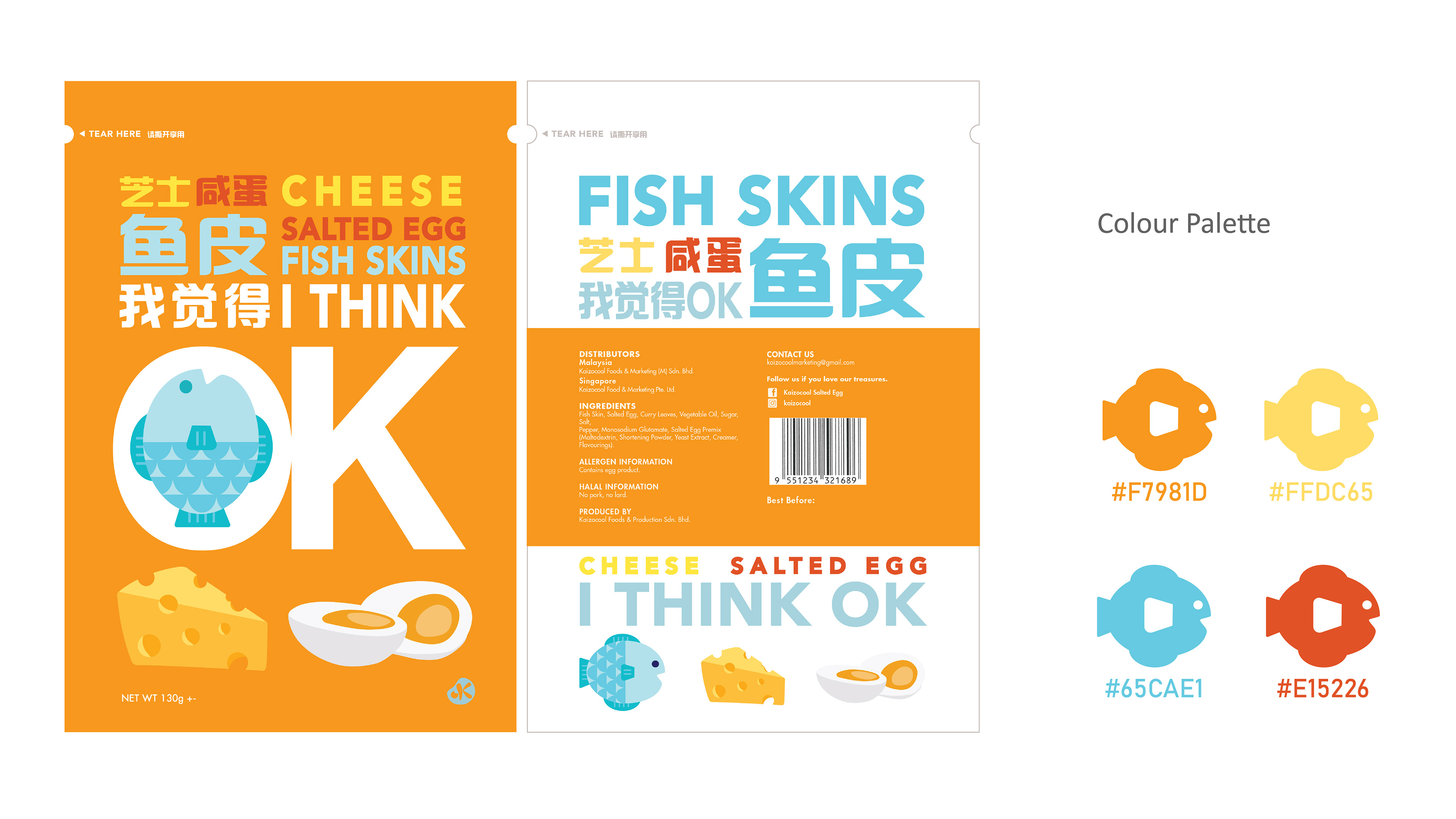
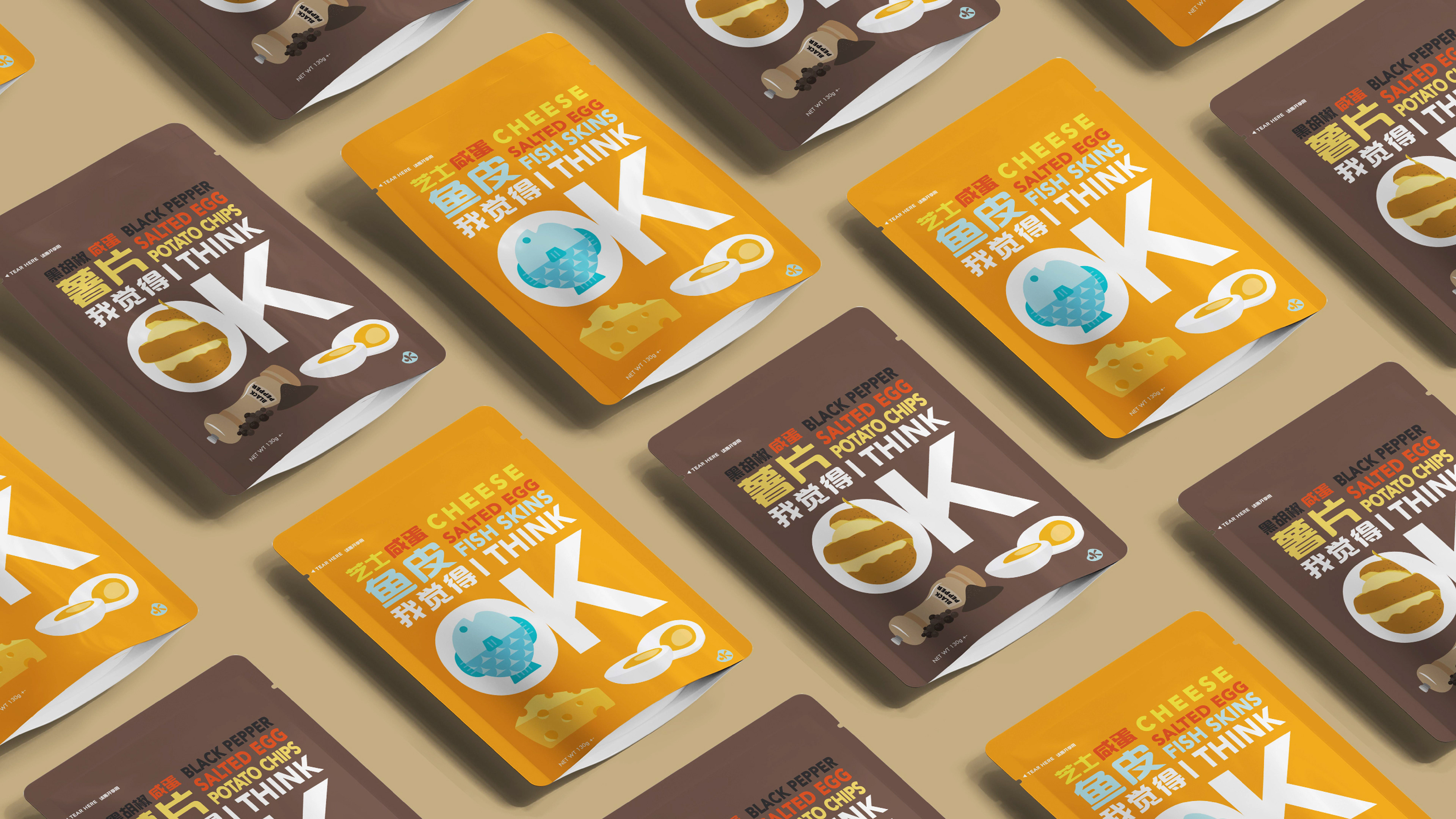
The branding direction of I THINK OK snacks are “young” and “trendy”. Therefore the Chinese name【我觉得OK】is a reference towards a trendy hip-hop tv programme back in the year 2018. It was a famous quote by a hip-hop artist that has been use by youngsters often. And by using a youth reference, it will bring the brand more closer towards the target audience due to the relatability.
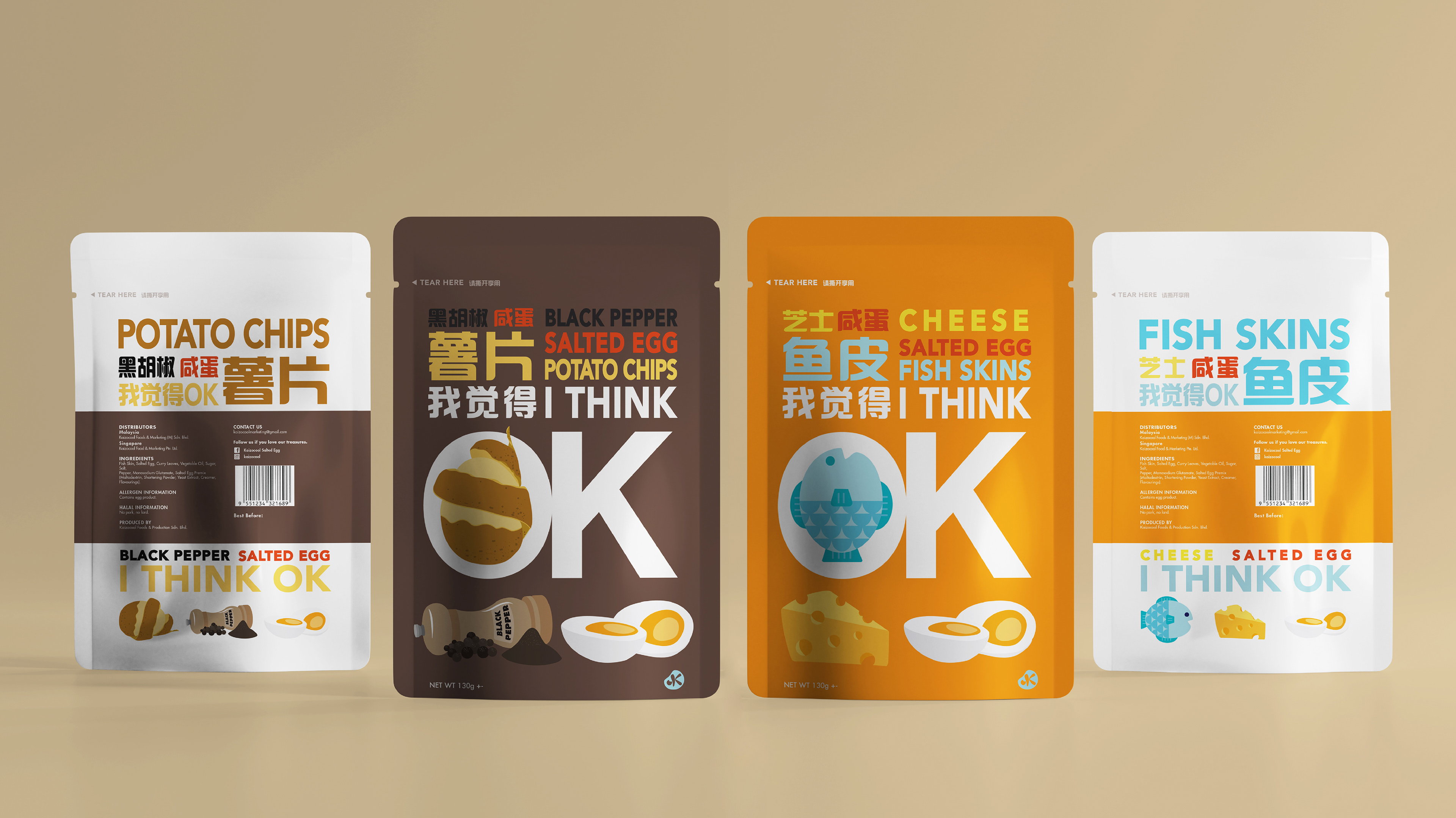
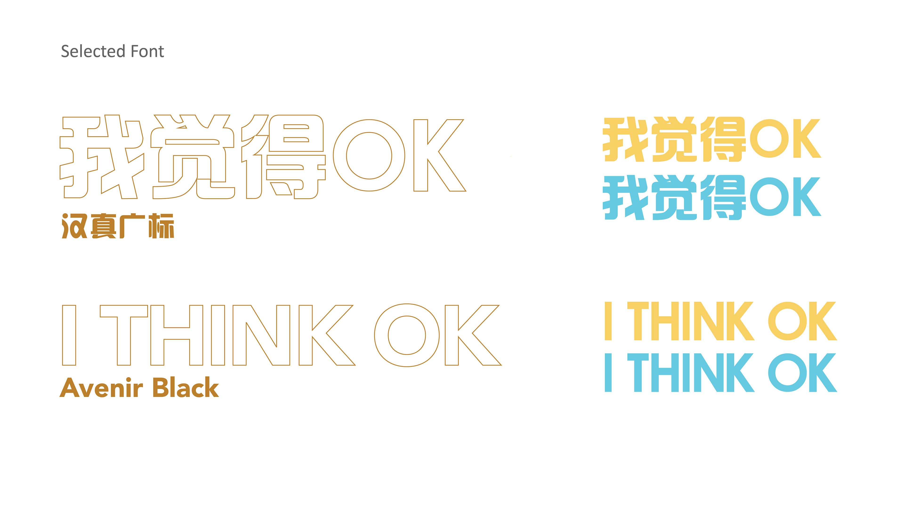
By using a clean layout and bold typeface, it brings out the flavour and information of the snack packaging.
Meanwhile each flavour has their own color as the main color of the packaging, and the illustration visuals are their own ingredients. This design direction allow the consumers to understand the packaging information in the shortest amount of time.
Meanwhile each flavour has their own color as the main color of the packaging, and the illustration visuals are their own ingredients. This design direction allow the consumers to understand the packaging information in the shortest amount of time.
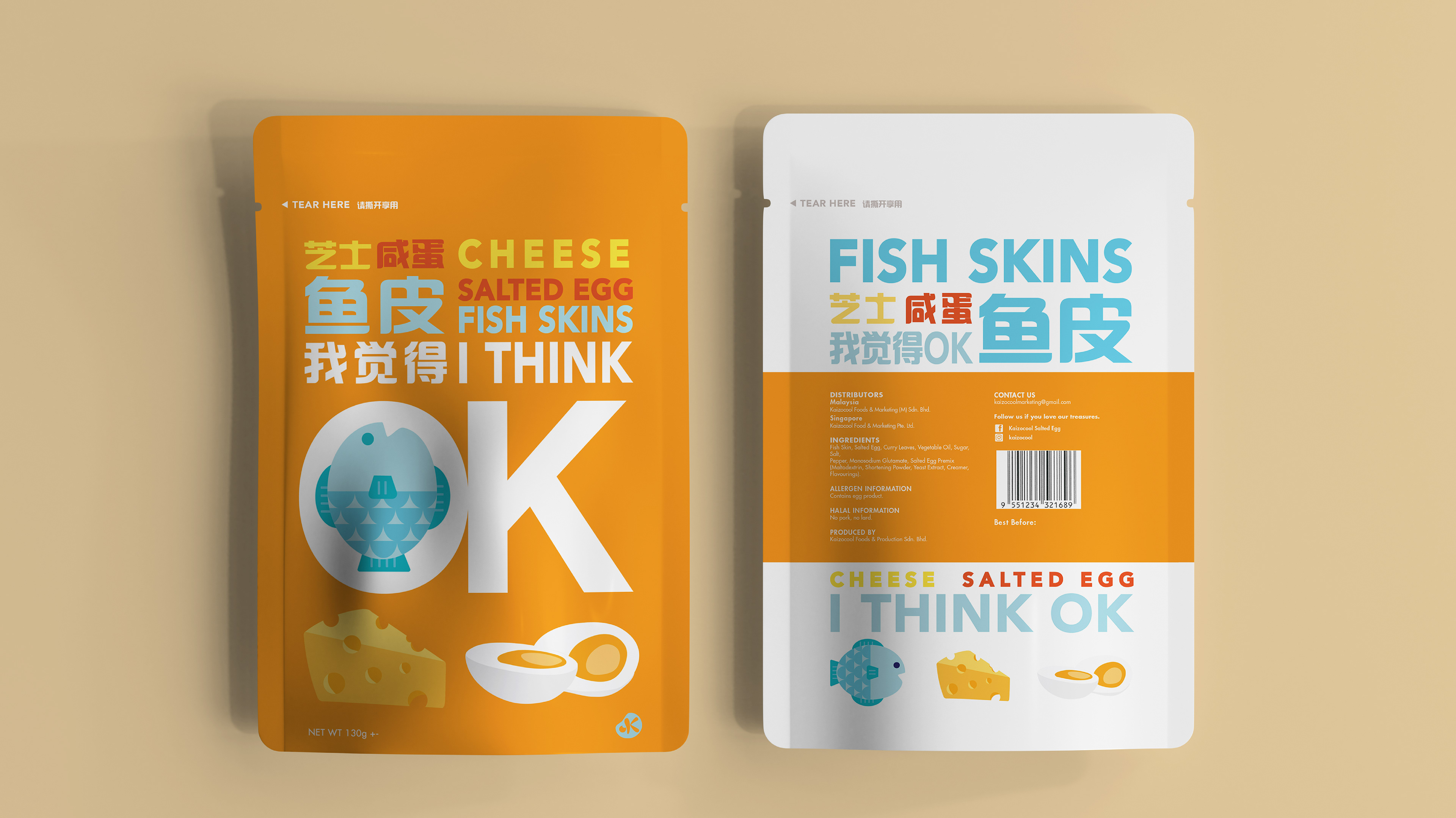
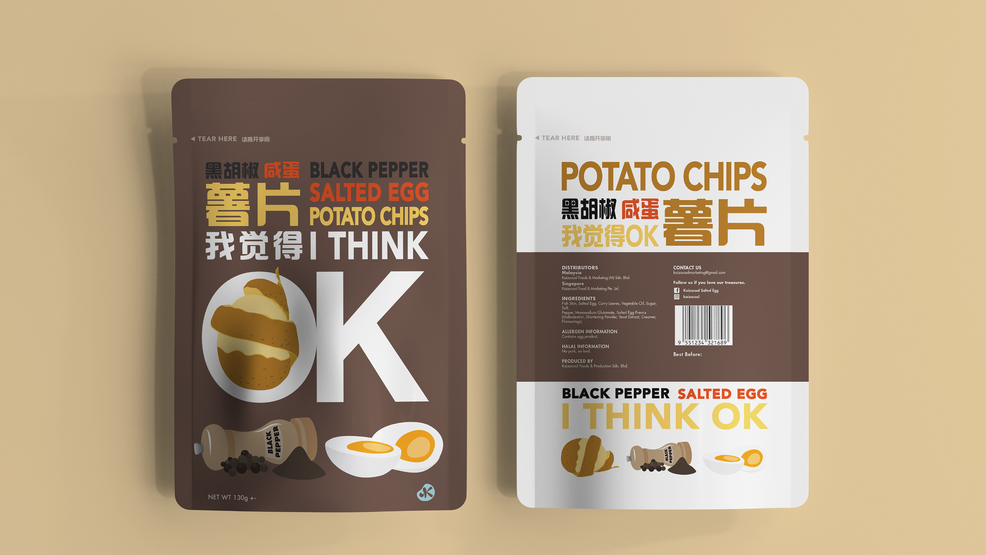
By using simple illustration to replace the mainstream real life snack photo as main visuals, also elevate the packaging in a more modern and trendy way.
THANK YOU
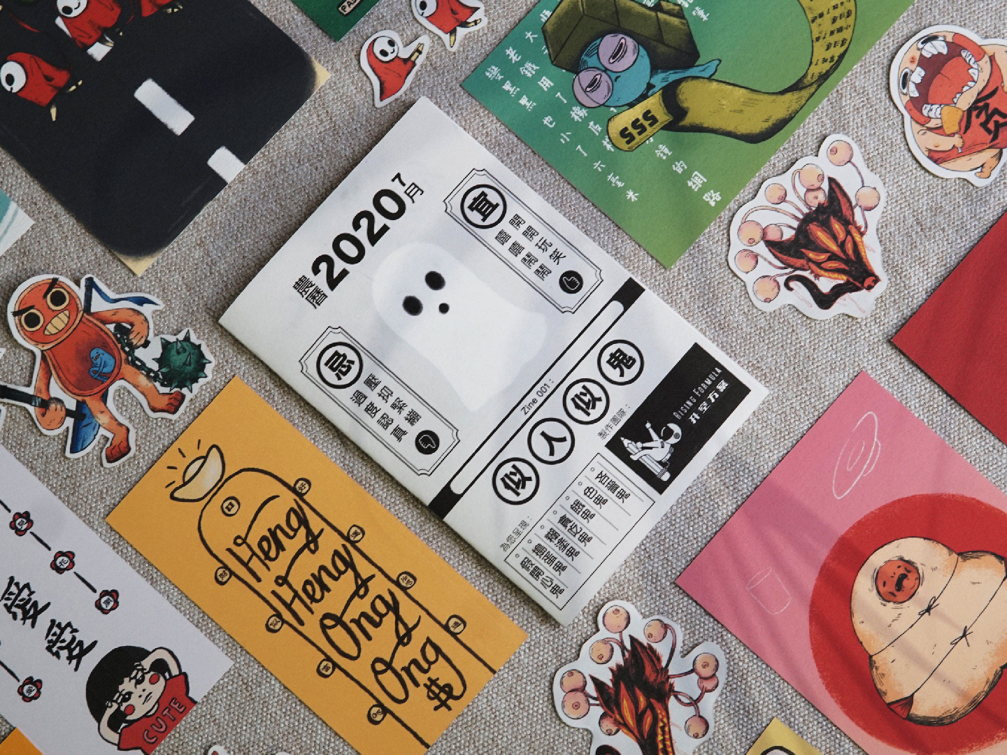
Designed by Rising Formula
Year 2021