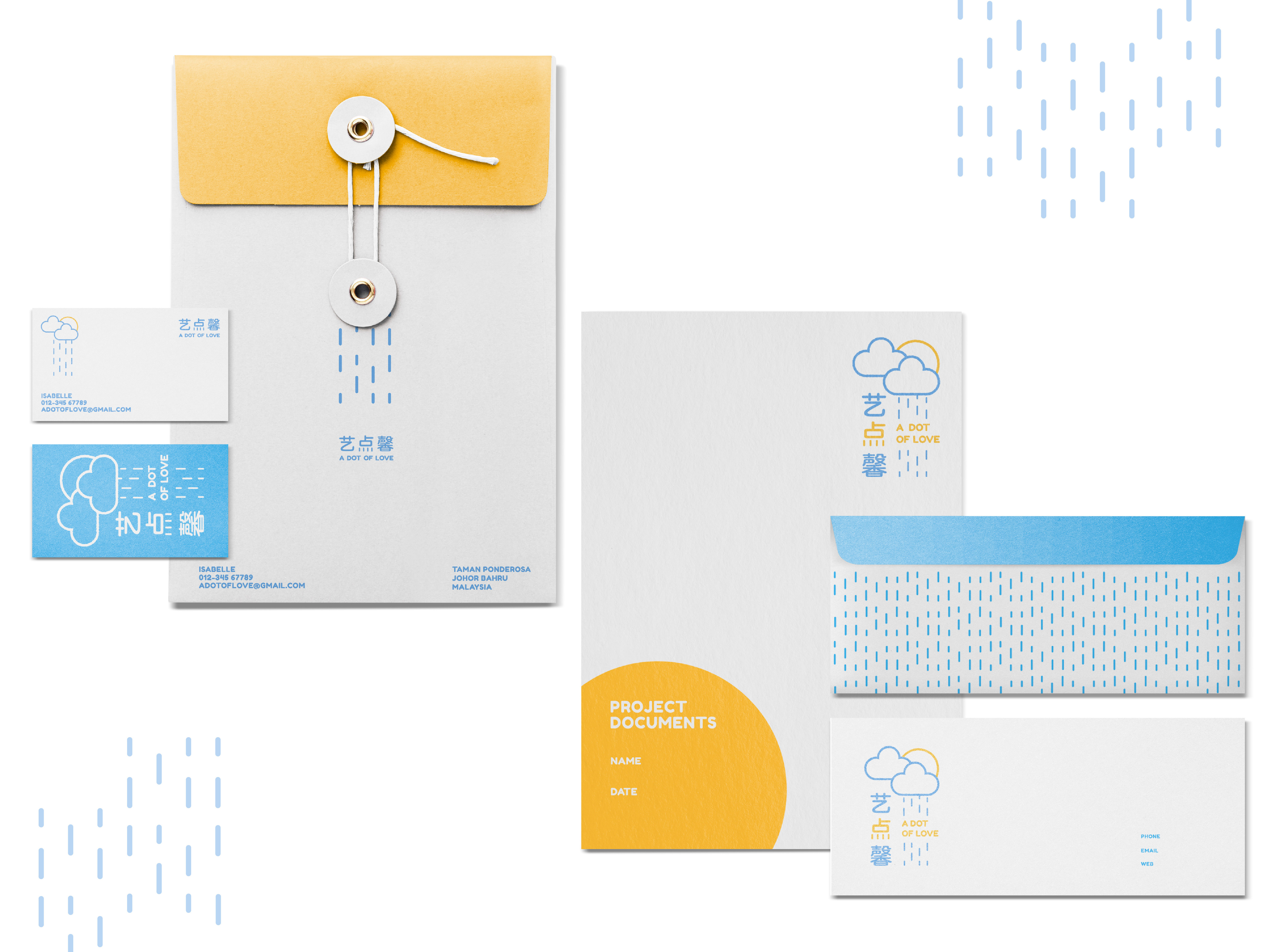
Packaging Design 02
Packaging illustration design / Brand visual / KaizoCool
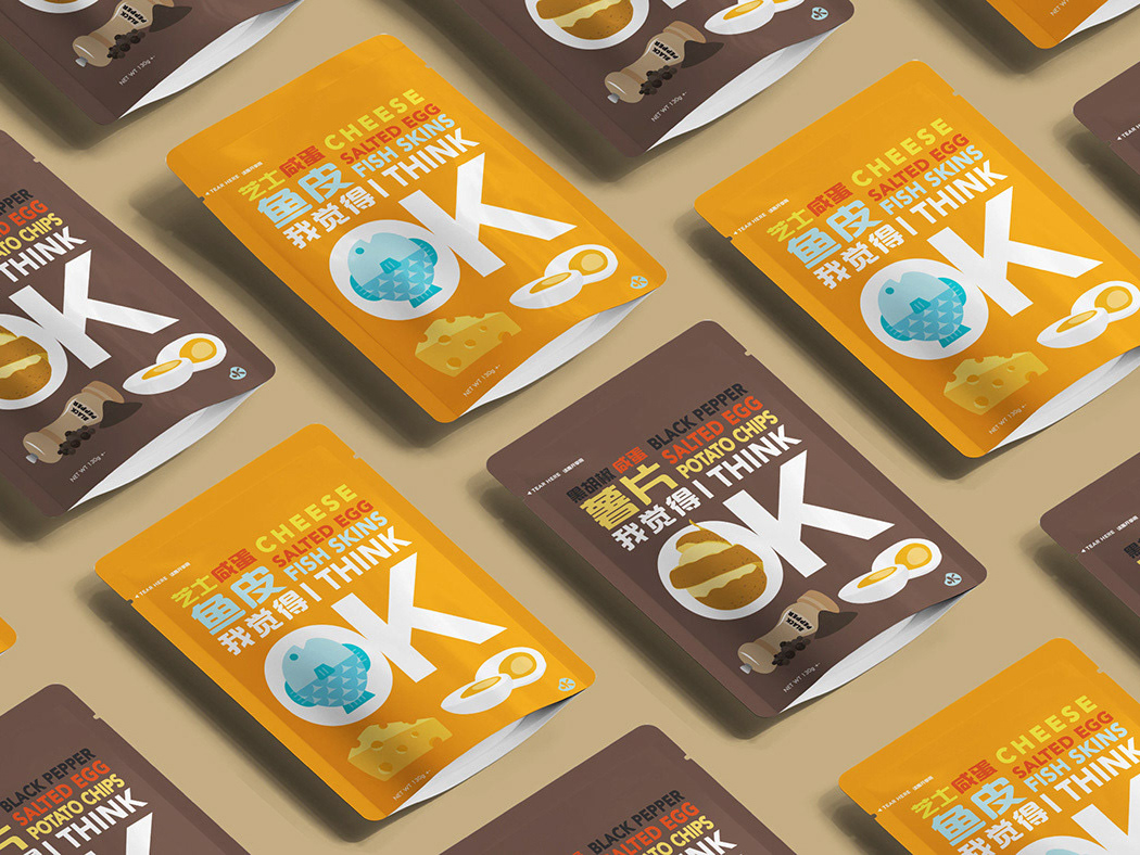
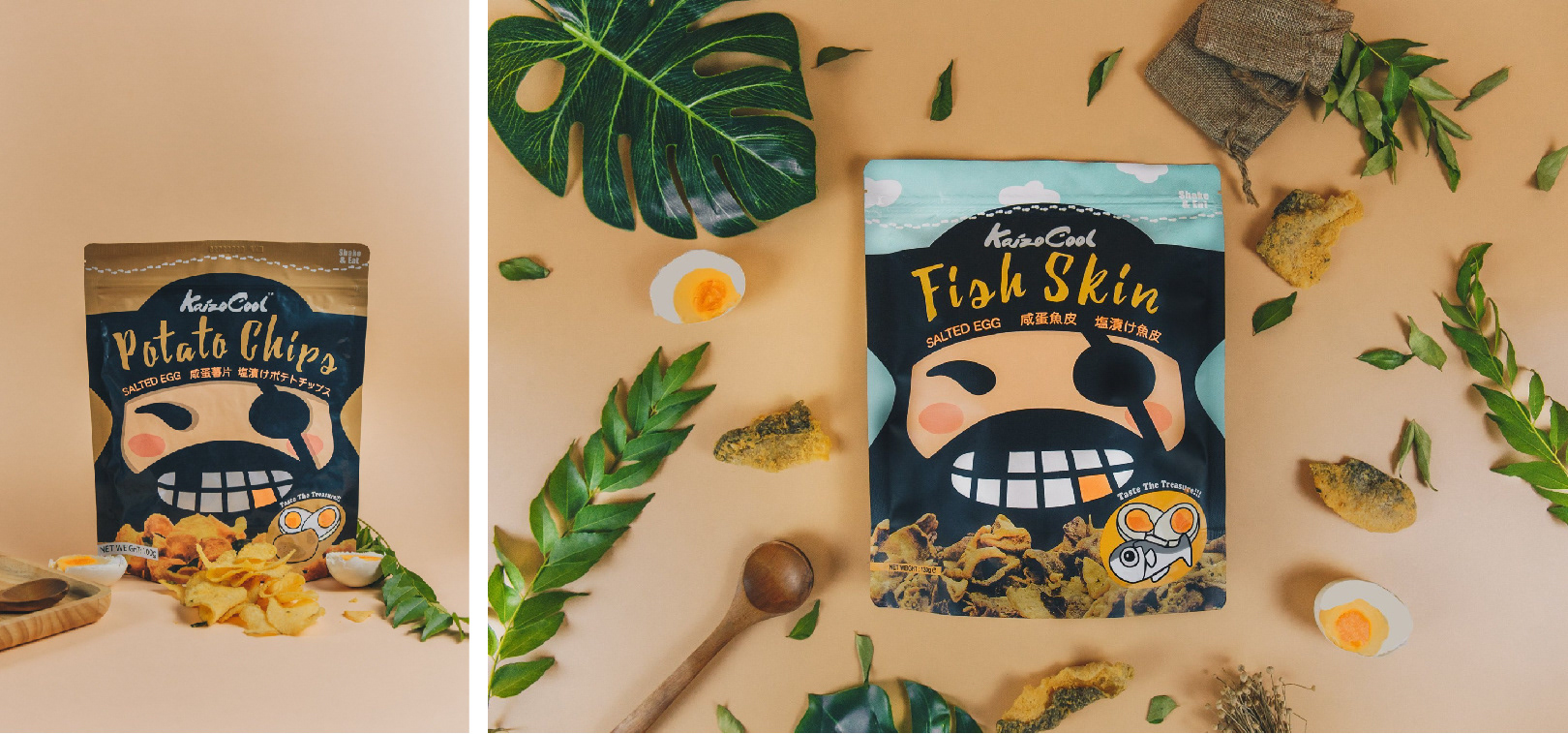
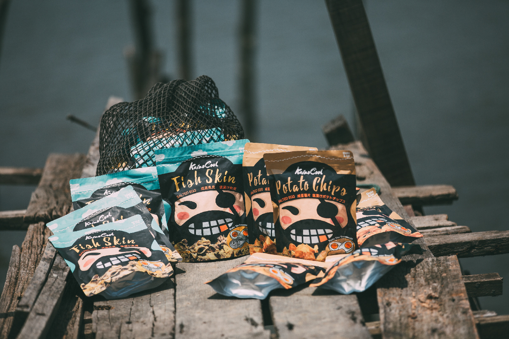
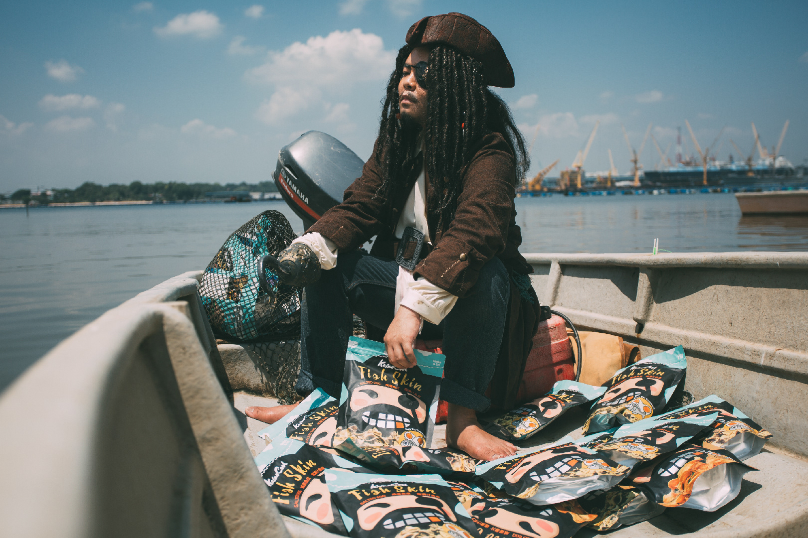
KaizoCool is a Malaysian snack company which specialize in salted egg snacks such as, Salted Egg Fish Skin, Spicy Salted Egg Fish Skin & Salted Egg Potato Chips.
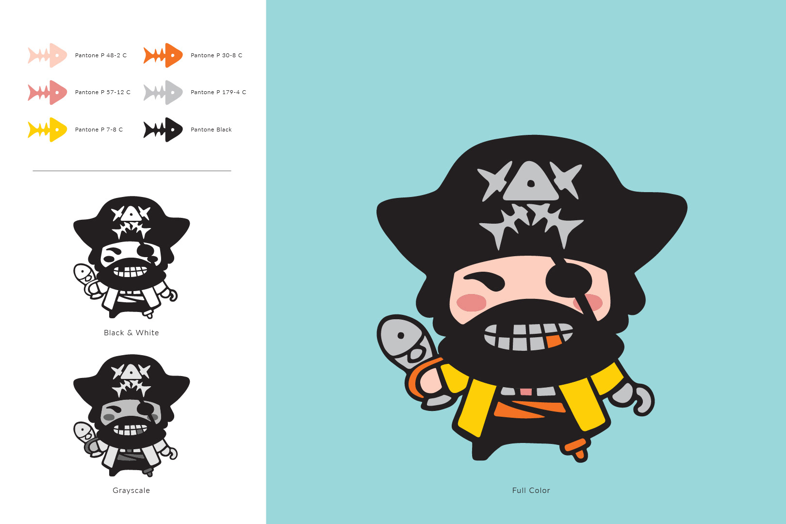
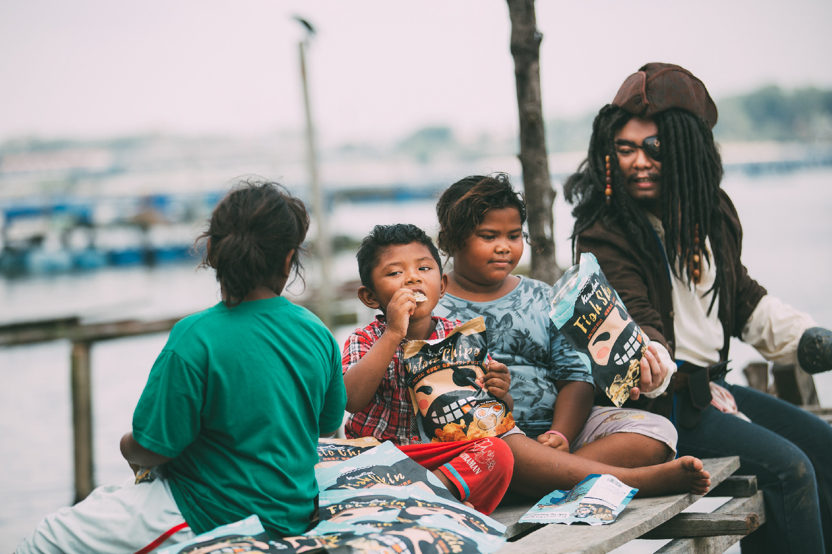
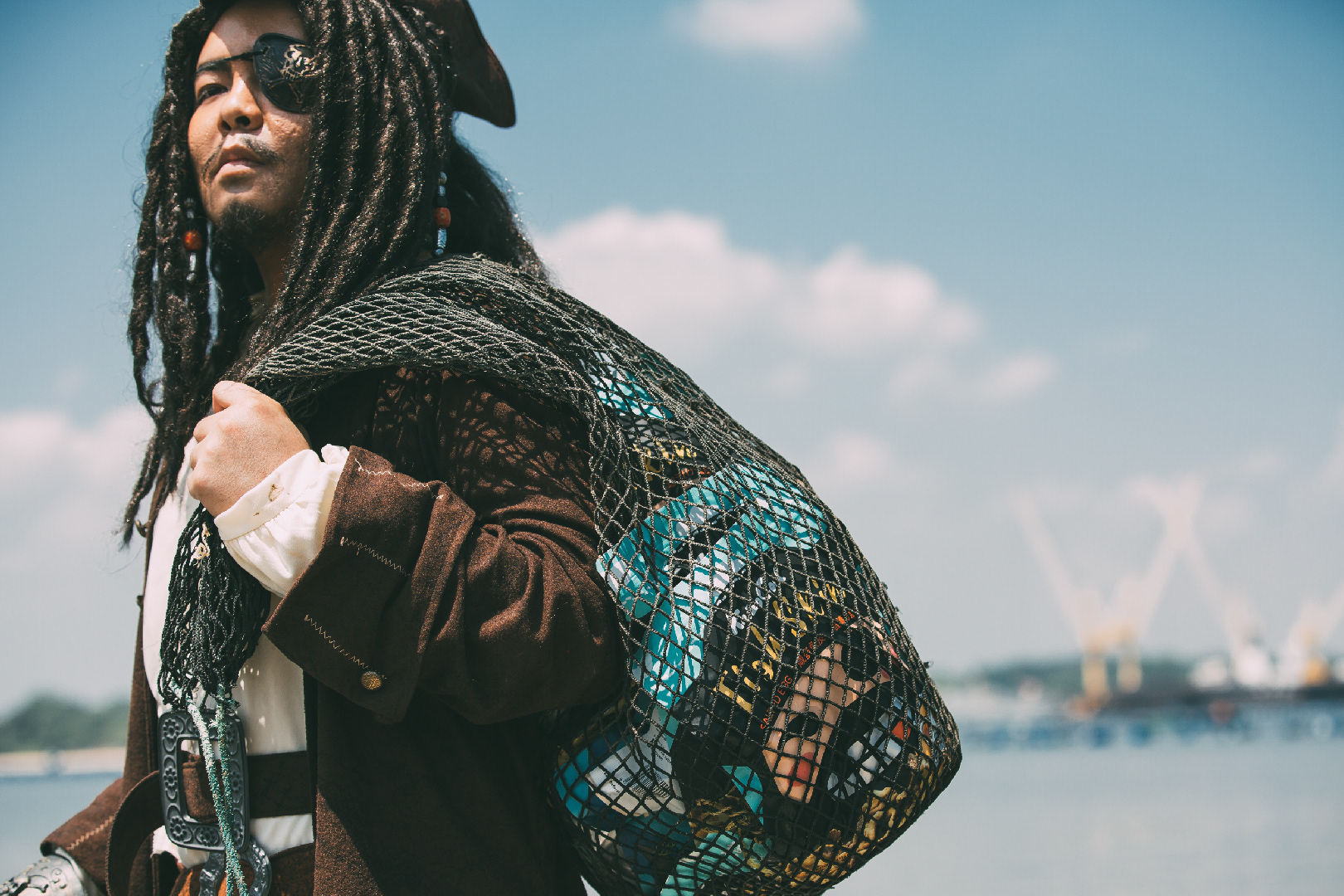
The brand concept for KaizoCool is pirate and treasure hunting, the main visual elements are pirate captain and fish, because their main product mostly consist of fish ingredient.
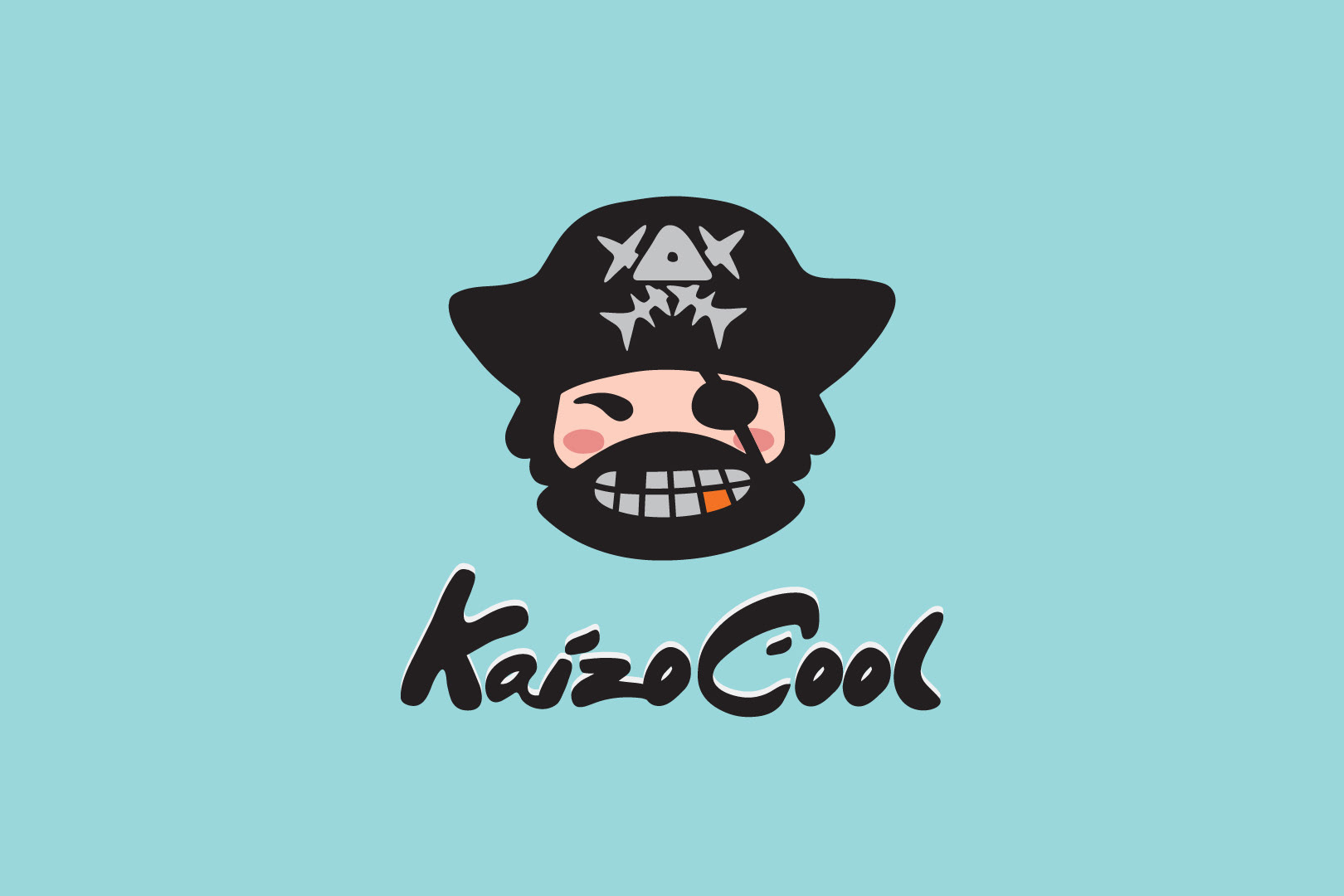
For the color scheme, Rising Formula Studio is using warm tones to resemble salted egg, the combination with black and grey pops out the color yellow, which makes this logo more recognisable.
Brand slogan for KaizoCool is "Not all treasure is silver and gold", for tasting a piece of KaizoCool salted egg chips feels like digging into treasure and tasting it.
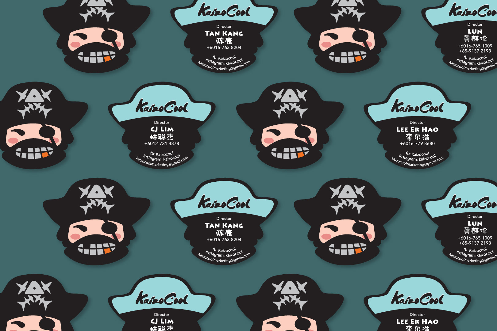
For the namecard design, Rising Formula Studio uses the logo pirate head as a die-cut namecard, resembles every team member of KaizoCool is a pirate captain, sets out to a journey of distributing fish chip treasure.
KaizoCool uses freshly imported dory fish skin and handpicked potatoes, match with their secret recipe of salted egg flavor and curry leaves, creates the amazing treasure-like flavour. KaizoCool products contain no preservatives, no artificial colors, and no artificial flavors.
THANK YOU
Designed by Rising Formula
Year 2017