BRANDING DESIGN 04
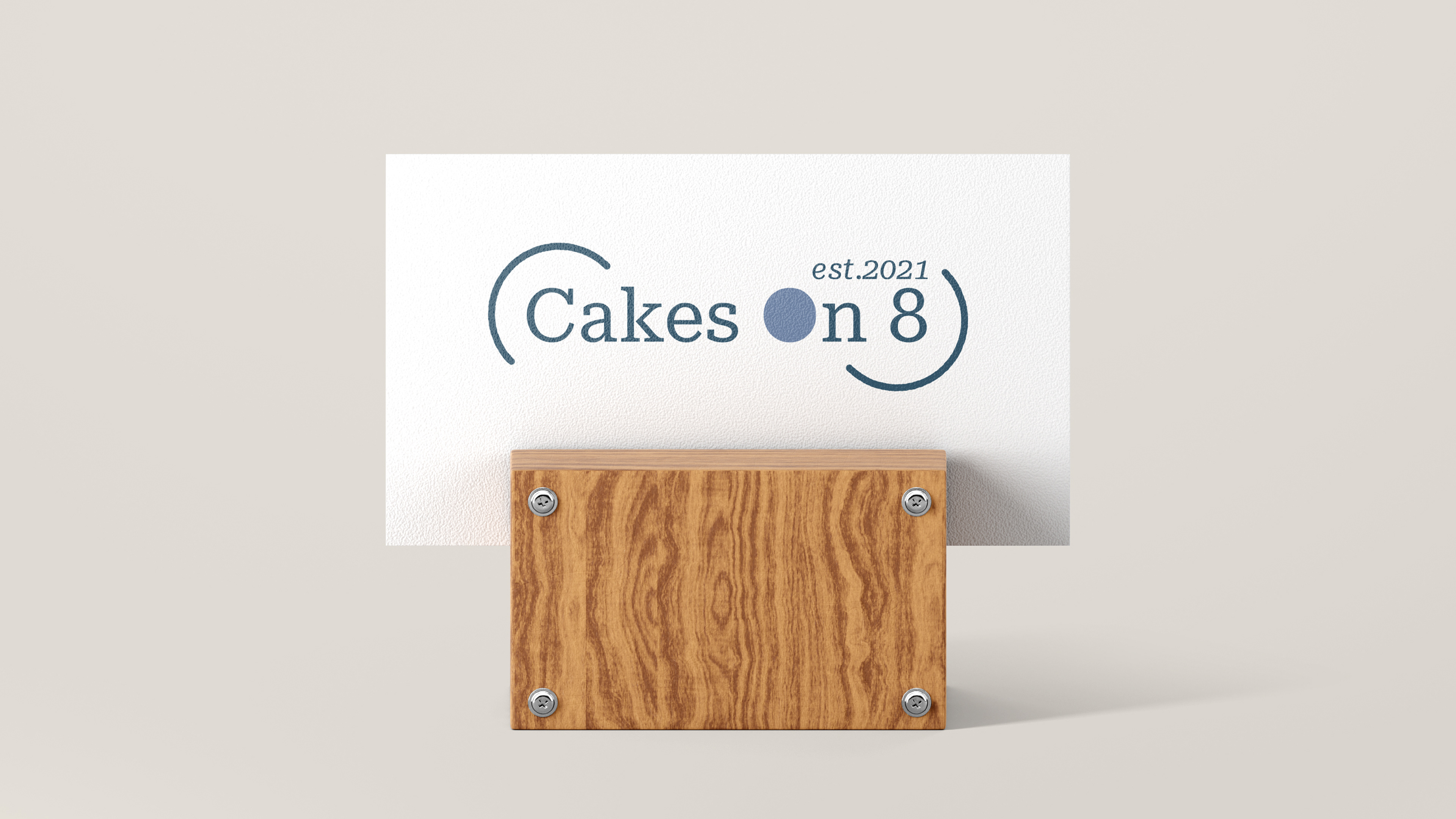
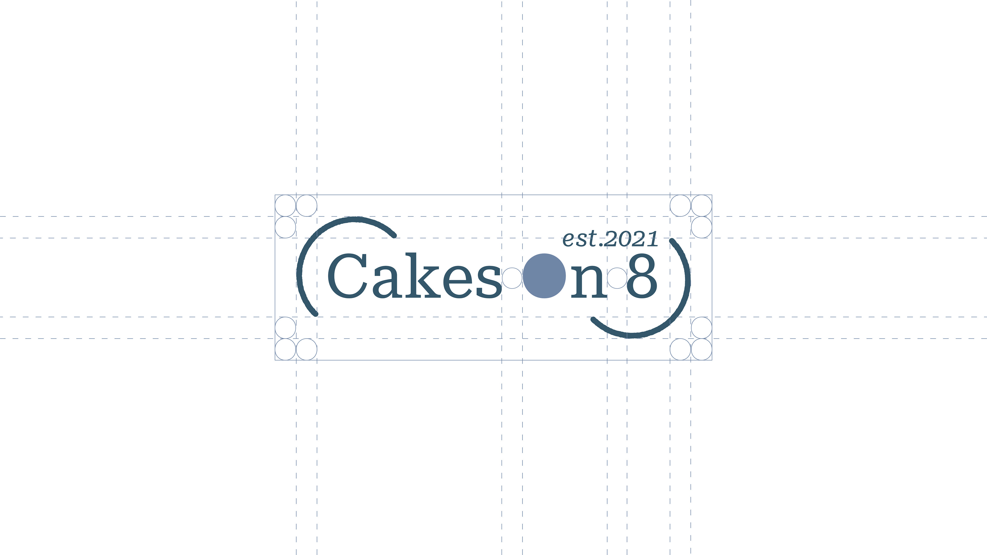
Logo Design / Visual Identity / Cakes On 8
Logo Design / Visual Identity / Cakes On 8
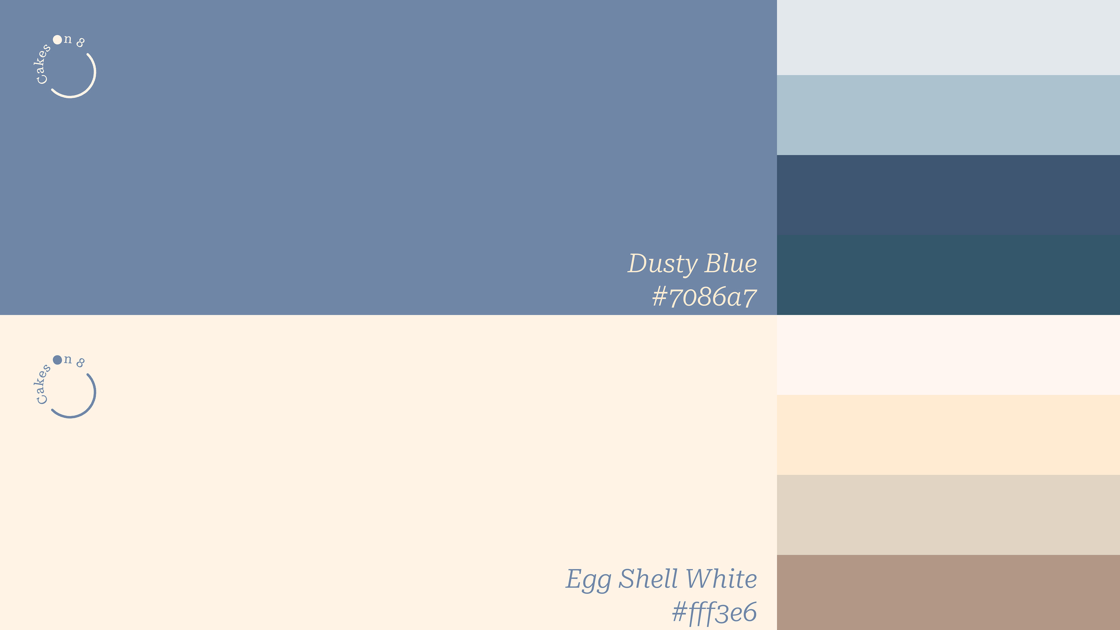
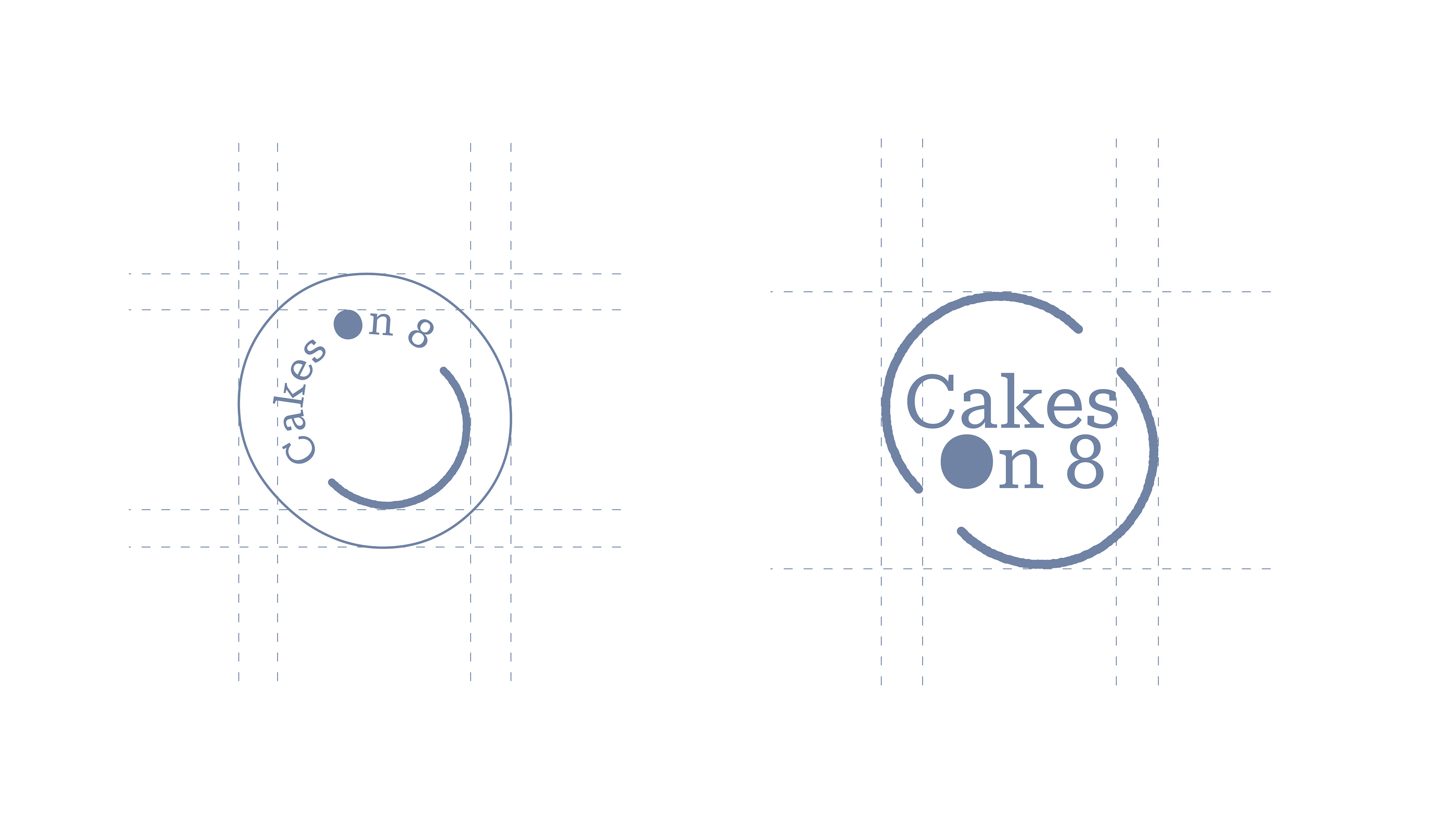
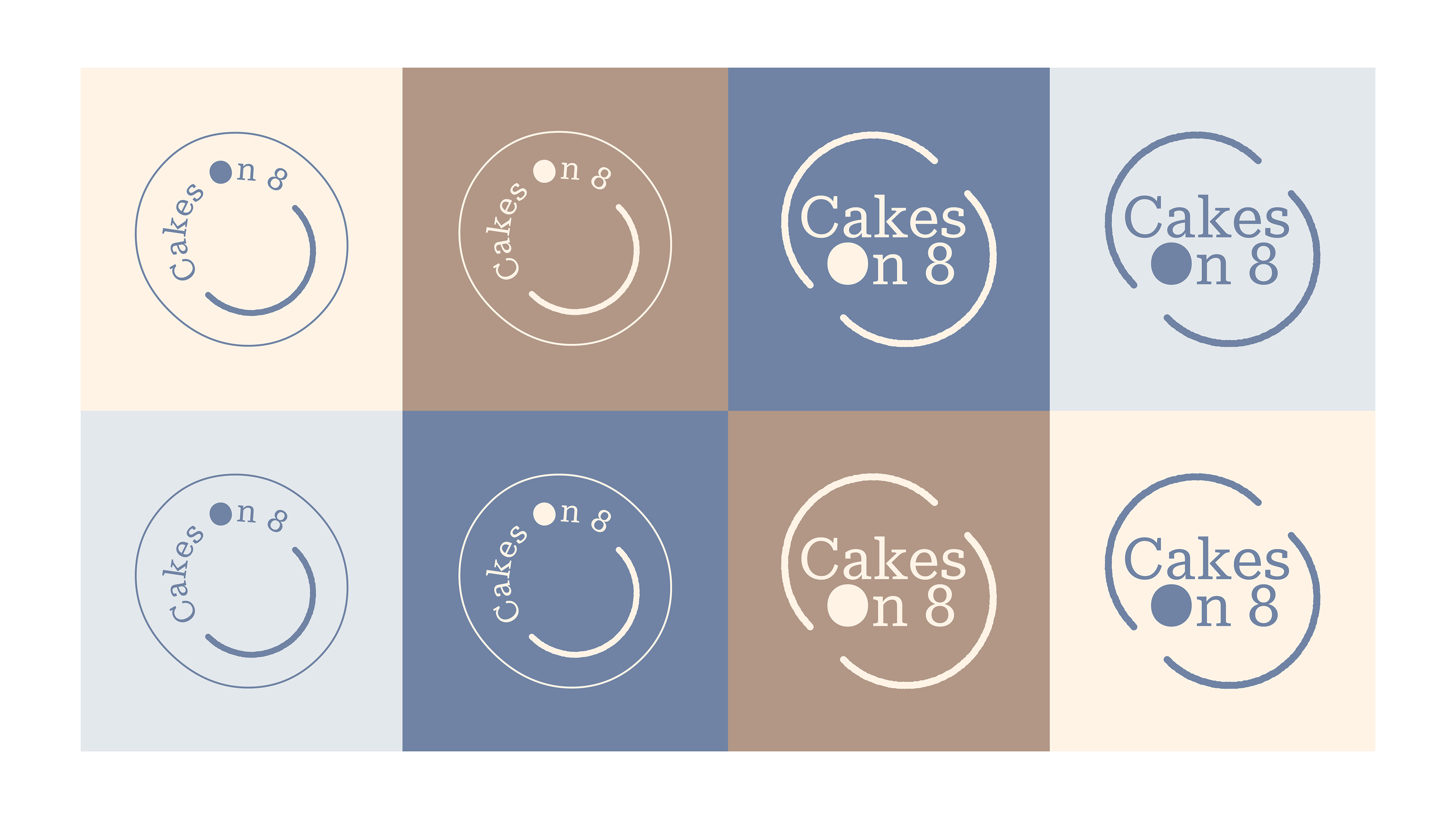
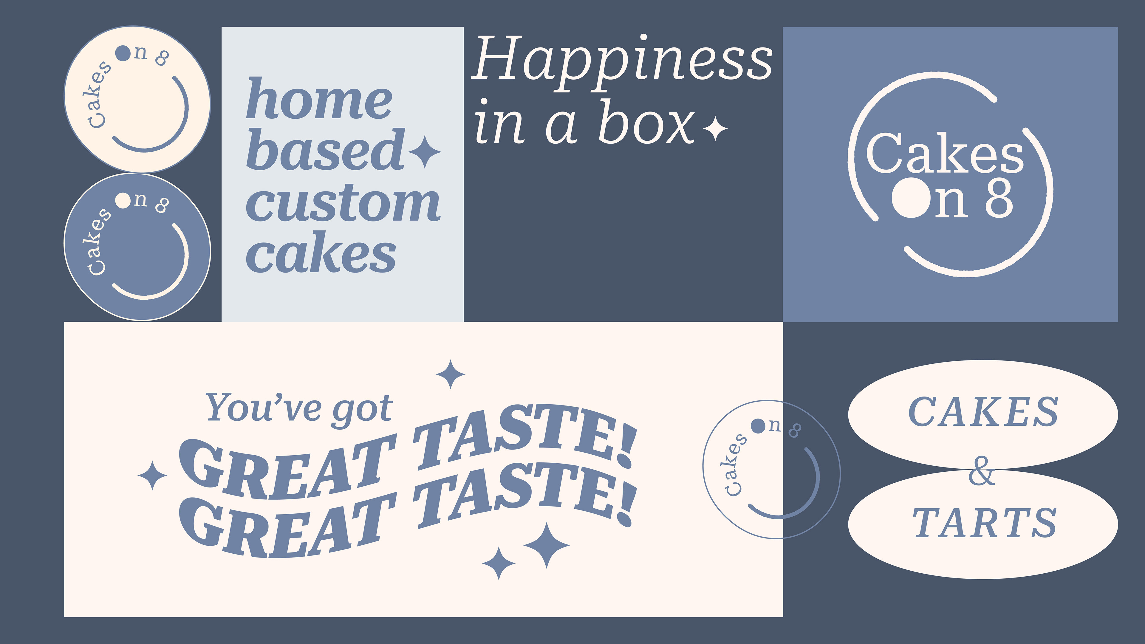
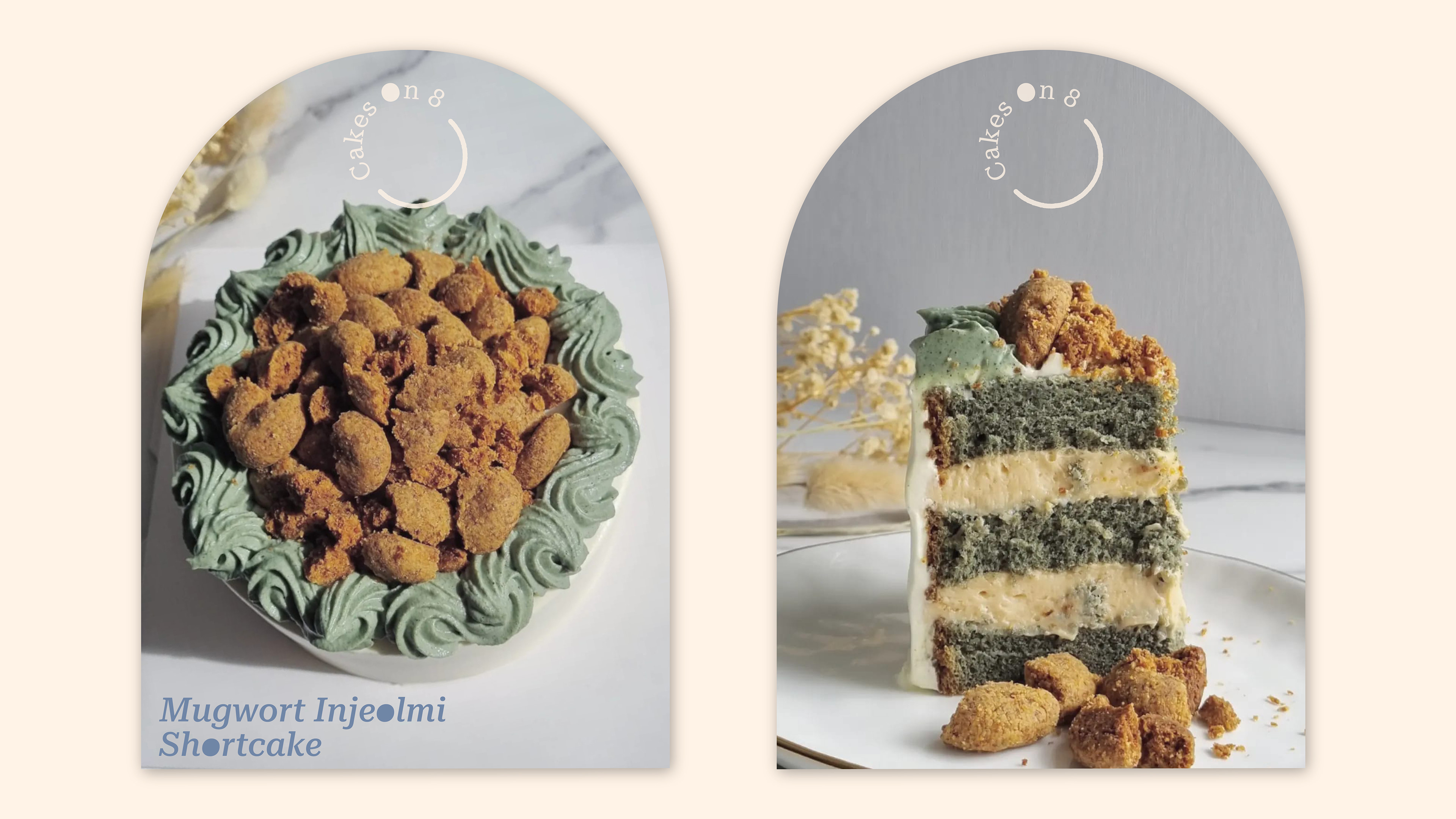
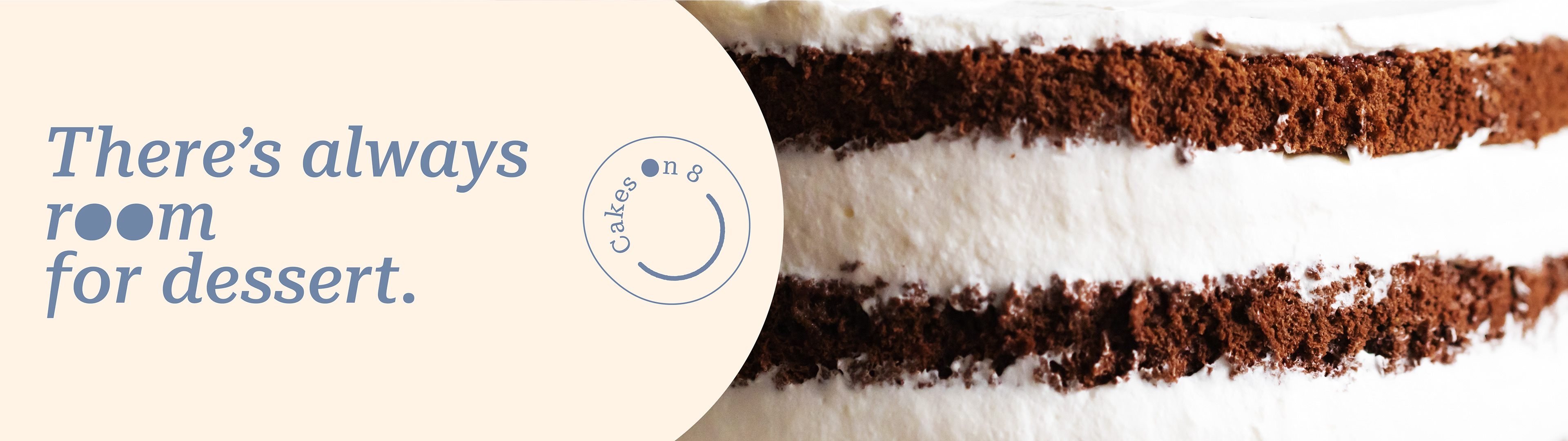
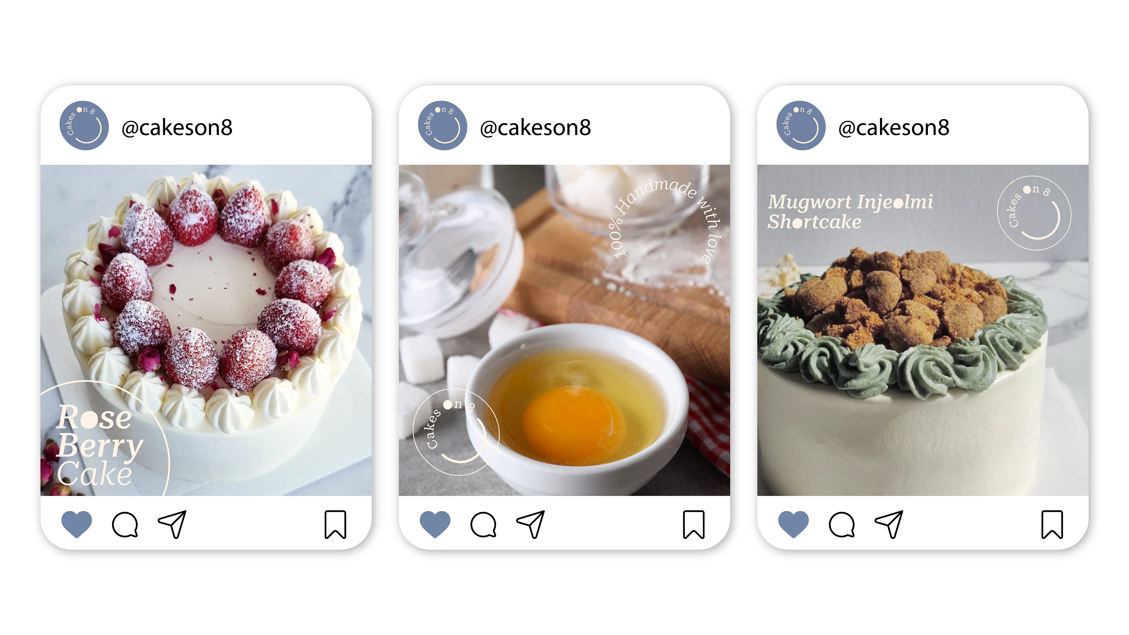
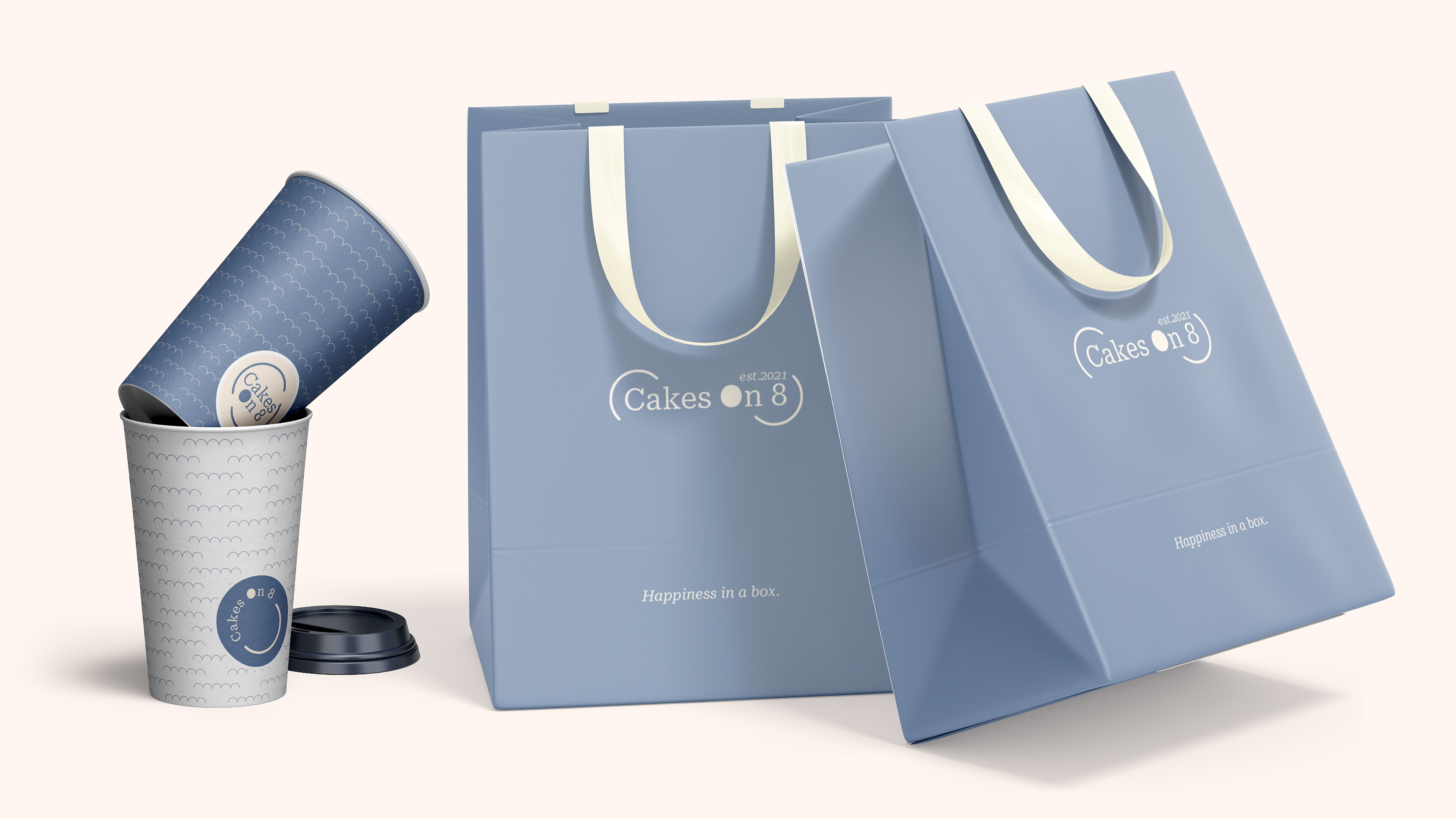
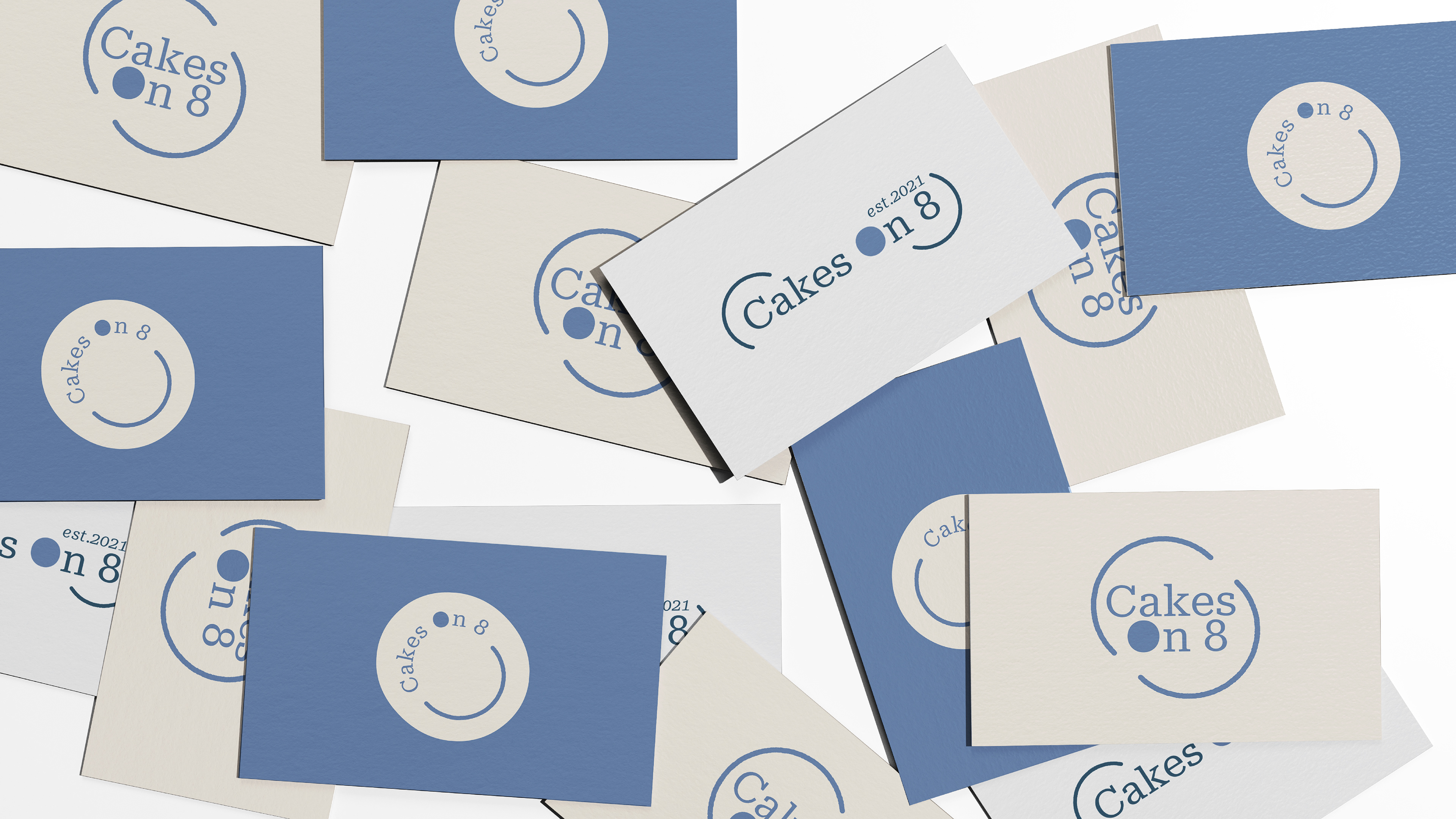
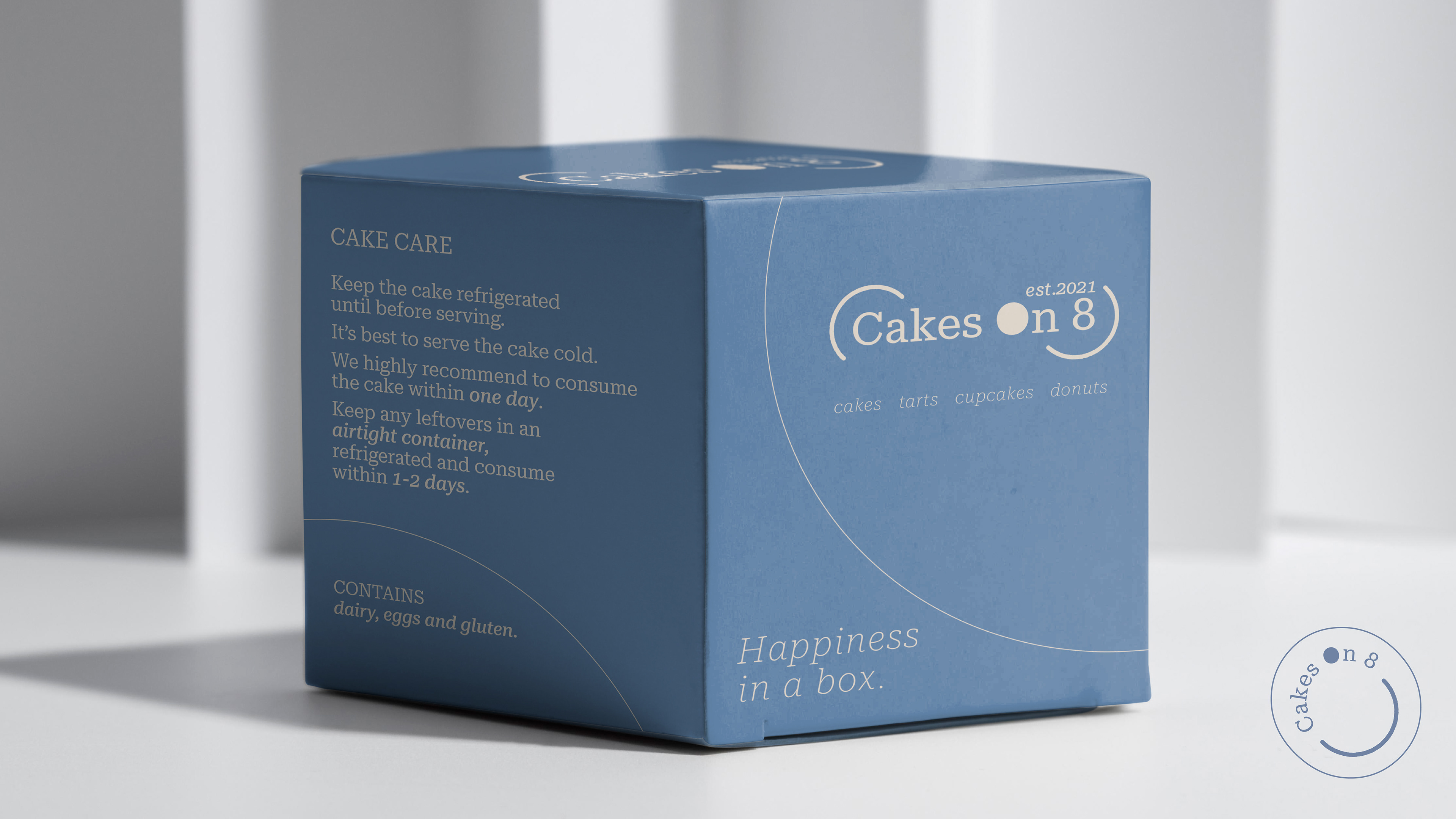
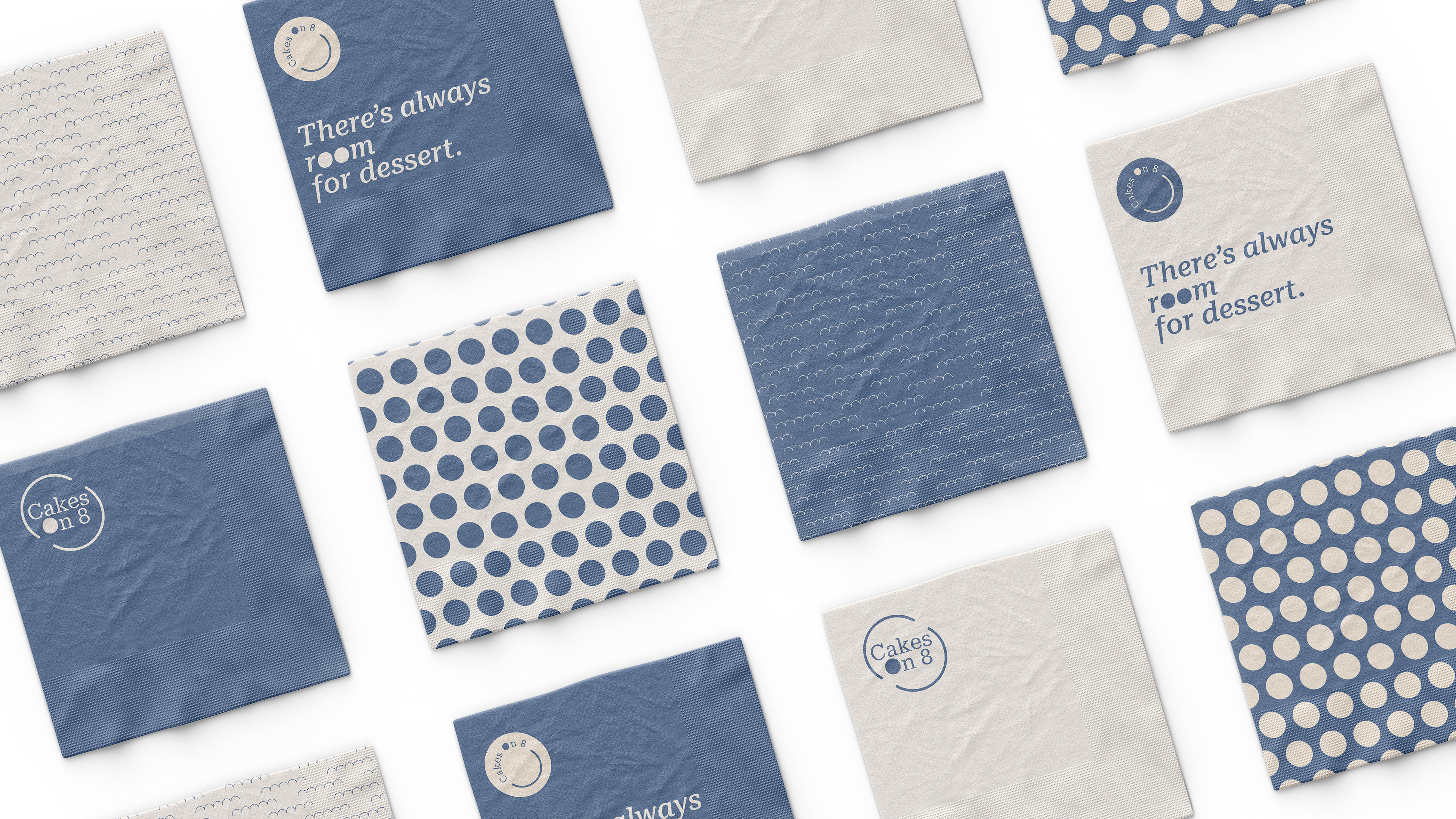
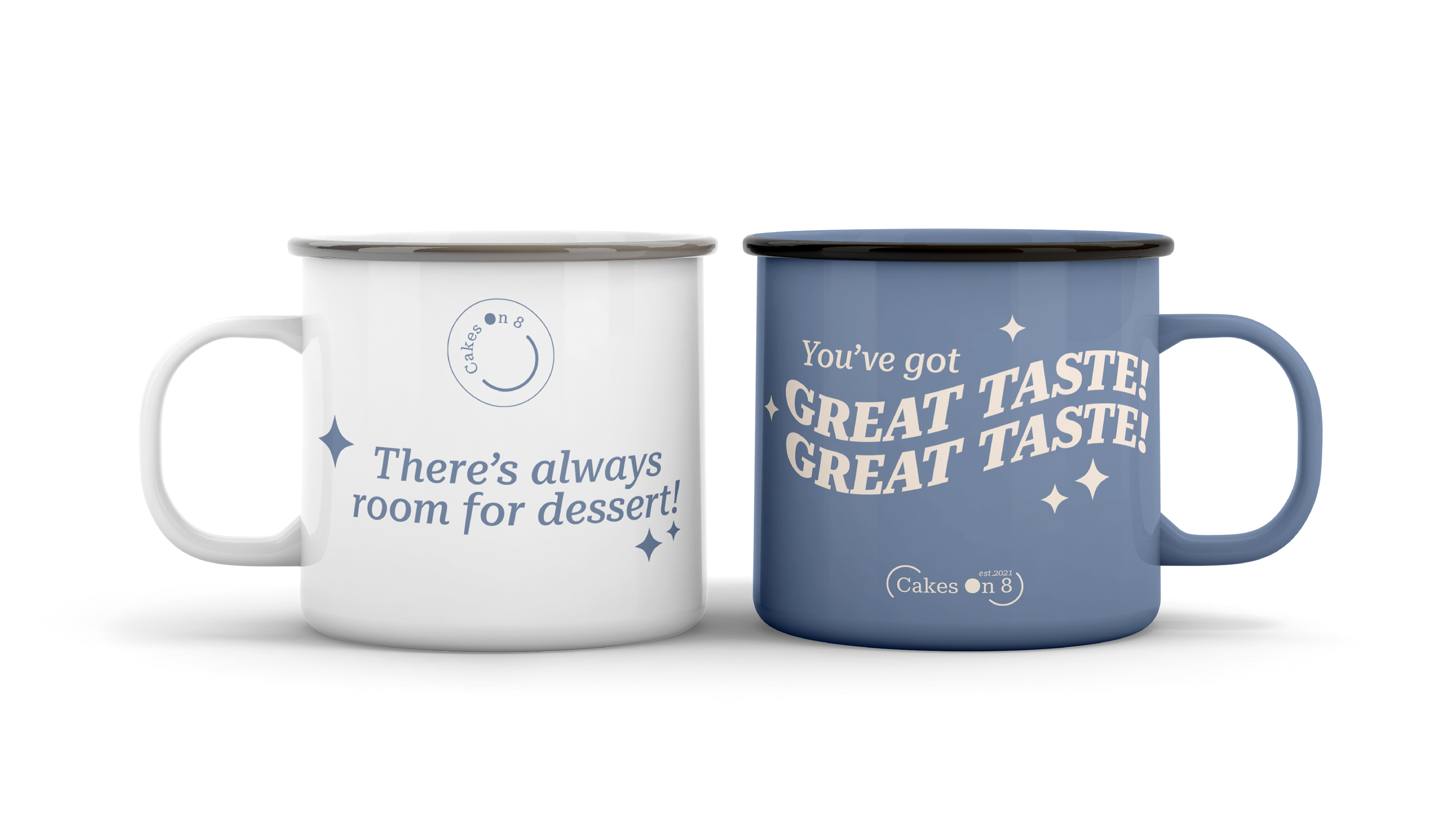
Visual identity for a homebased pastry brand from Australia. Cakes On 8 focuses on Korean and Japanese style cakes, which simplicity is the main design direction. The owner found her passion for baking during lockdown due to the global pandemic, and she fell in love with baking ever since.
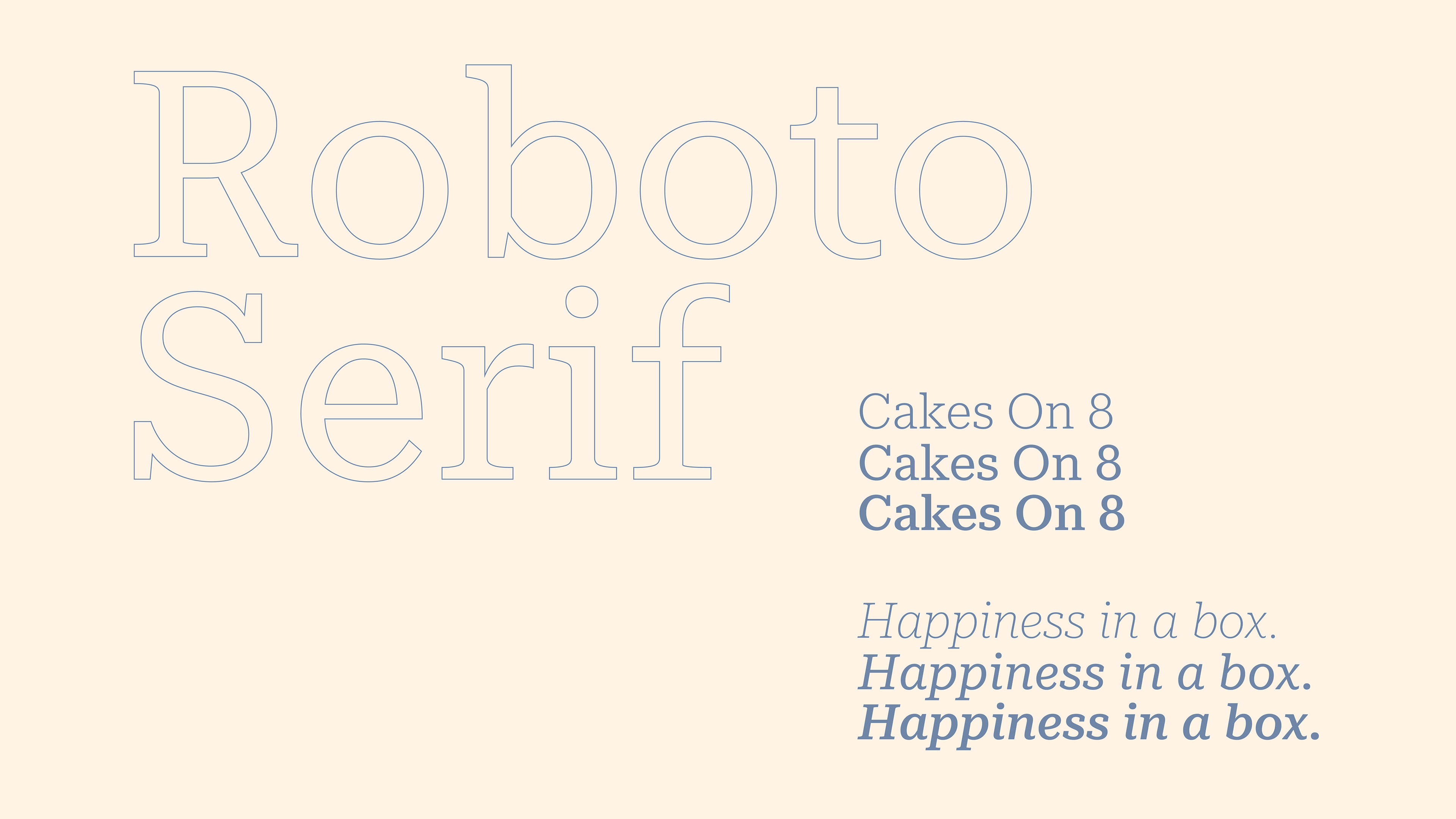
The number "8" rhymes with egg, therefore the logo idea of cracking open an egg when preparing cake dough during baking, and the solid "O" symbolises the egg yolk. By combining simple elements on a serif typeface, created an elegant and classy logo which speaks for the brand and products.


THANK YOU
Designed by Rising Formula
Year 2022